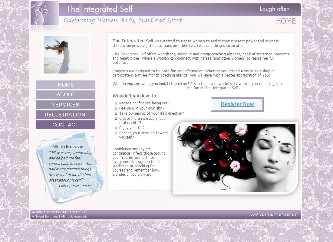
My client was starting up a new business and had a product he wanted to sell online.
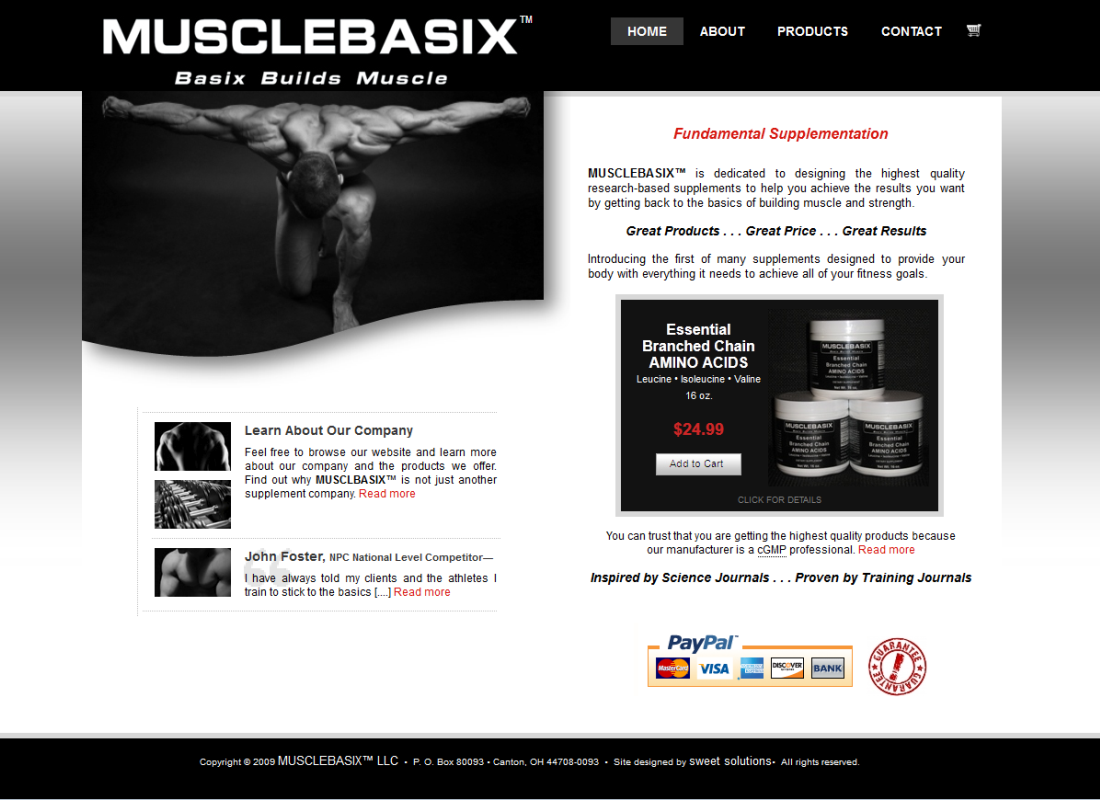
Taking my cue from the product’s label (a basic black, which was used for the title/top banner), I designed the layout in black on white, against a “shiny” steel gray background, using bright red as an accent.
All photos were converted to black-and-white. The main image on the HOME page was customized with a curved bottom, to soften any hard lines, and a shadow effect, to give the page depth.
Simple, but effective. It catches your eye, and draws you in.
Musclebasix
Brochure business website
Custom design
Custom photo
Top menu with rollovers
PayPal shopping cart
Image highlight rollover
PDF download
Encrypted email
Secure contact form
Custom favicon


