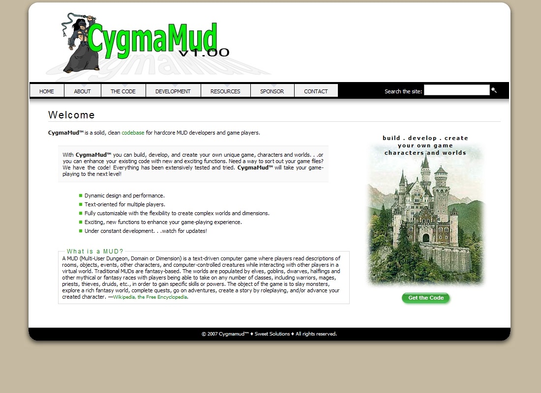
He wanted a website where he could talk about the code, offer it for download, continue development, and find sponsors.
Color scheme for the layout for CygmaMud was inspired by the photo of a castle chosen for the HOME page. A bright green, used for the custom title image and “Get the Code” button, pops on the page.
Text is carefully placed to provide plenty of white space for easy reading.
CygmaMud
Personal website
Custom design in WordPress
Custom title/banner
Dynamic top menu with rollovers
Zip file download
Sponsor sign-up form
Seach form
Secure contact form
Encrypted email
Custom favicon

